Python:Plotting
This page will primarily go over some examples of different ways to plot data sets. It assumes
import math as m
import numpy as np
import matplotlib.pyplot as plt
is in the program.
Contents
Introduction
For a good tutorial on using the matplotlib.pyplot module - especially the object-oriented approach, seePython Plotting With Matplotlib (Guide) by Brad Solomon as recommended by Dr. Mark Palmeri, Duke BME.
Note that commands given as plt.COMMAND() may also apply to either a figure or a set of axes or both. In the examples below, typically the fig, ax = plt.subplots() command will be used to create handles to the figure and one or more sets of axes within it and then plotting commands will be called on those handles rather than on plt itself.
The plt.plot() Function
The plt.plot() function is used to plot sets of data on a 2-D grid.
What follows comes from matplotlib.pyplot's help function (some paragraphs have been snipped out). The line styles, symbols, and colors are formatted as a clearer table.
plot(*args, **kwargs)
    Plot lines and/or markers to the
    :class:`~matplotlib.axes.Axes`.  *args* is a variable length
    argument, allowing for multiple *x*, *y* pairs with an
    optional format string.  For example, each of the following is
    legal::

        plot(x, y)        # plot x and y using default line style and color
        plot(x, y, 'bo')  # plot x and y using blue circle markers
        plot(y)           # plot y using x as index array 0..N-1
        plot(y, 'r+')     # ditto, but with red plusses

    If *x* and/or *y* is 2-dimensional, then the corresponding columns
    will be plotted.

    If used with labeled data, make sure that the color spec is not
    included as an element in data, as otherwise the last case
    ``plot("v","r", data={"v":..., "r":...)``
    can be interpreted as the first case which would do ``plot(v, r)``
    using the default line style and color.

    If not used with labeled data (i.e., without a data argument),
    an arbitrary number of *x*, *y*, *fmt* groups can be specified, as in::

        a.plot(x1, y1, 'g^', x2, y2, 'g-')

    Return value is a list of lines that were added.

    By default, each line is assigned a different style specified by a
    'style cycle'.  To change this behavior, you can edit the
    axes.prop_cycle rcParam.

    The following format string characters are accepted to control
    the line style or marker (and) the following color abbreviations are supported:
|
|
|
    In addition, you can specify colors in many weird and
    wonderful ways, including full names (``'green'``), hex
    strings (``'#008000'``), RGB or RGBA tuples (``(0,1,0,1)``) or
    grayscale intensities as a string (``'0.8'``).  Of these, the
    string specifications can be used in place of a ``fmt`` group,
    but the tuple forms can be used only as ``kwargs``.

    Line styles and colors are combined in a single format string, as in
    ``'bo'`` for blue circles.

    The *kwargs* can be used to set line properties (any property that has
    a ``set_*`` method).  You can use this to set a line label (for auto
    legends), linewidth, anitialising, marker face color, etc.  Here is an
    example::

        plot([1,2,3], [1,2,3], 'go-', label='line 1', linewidth=2)
        plot([1,2,3], [1,4,9], 'rs',  label='line 2')
        axis([0, 4, 0, 10])
        legend()

    If you make multiple lines with one plot command, the kwargs
    apply to all those lines, e.g.::

        plot(x1, y1, x2, y2, antialiased=False)

    Neither line will be antialiased.

    You do not need to use format strings, which are just
    abbreviations.  All of the line properties can be controlled
    by keyword arguments.  For example, you can set the color,
    marker, linestyle, and markercolor with::

        plot(x, y, color='green', linestyle='dashed', marker='o',
             markerfacecolor='blue', markersize=12).
The plt.savefig() Function
The plt.savefig() function is used to save a plot to a file. The type of sile is determined by the extension of the file name. For example,
plt.savefig('blah.eps')
will save the file to a color Encapsulated PostScript file, while
plt.savefig('blah.pdf')
will save it to a PDF. From the help file for the command, Most backends support png, pdf, ps, eps and svg.
Example
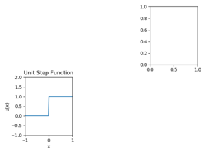
The following Python code demonstrates how to fill the fourth window of a 2x3 plot figure and save the figure as a PNG file; the resulting figure is in the thumbnail at right.
# Import required modules
import numpy as np
import matplotlib.pyplot as plt

# Create a 100 numbers between -1 and 1
x = np.linspace(-1, 1, 100);

# This formula for usf is one of several ways to define the unit step function
def usf(t):
    return (t>=0)*1.0;

# Create a figure with two rows of three figures
fig, ax = plt.subplots(num=0)
fig.clf()
fig, ax = plt.subplots(2, 3, num=0)

# Plot the values of the function usf(x) against the vector x in bottom left
ax[1][0].plot(x, usf(x))

# Change the axes so the function is not covered by the subplot box
ax[1][0].axis([-1, 1, -1, 2])

# Give the current subplot a title
ax[1][0].set_title('Unit Step Function')

# Set the x-label
ax[1][0].set_xlabel('x')

# Set the y-label
ax[1][0].set_ylabel('u(x)')

# Clear the rest other than bottom left and top right
fig.delaxes(ax[0][0])
fig.delaxes(ax[0][1])
fig.delaxes(ax[1][1])
fig.delaxes(ax[1][2])

# Issue tight layout to fix label overlaps
fig.tight_layout()

# Send the current figure to a file named usfplot.png
fig.savefig('usfplot.png')
Python Settings
For this course, you will generally want to have your graphics set to automatic; to make this change in Spyder:
- Open the preferences window
- On Windows, go to the Tools menu near the top right of the window and select Preferences
- On MACs, go to the python menu near the top left of the window and select Preferences
- In the Preferences window at the left select IPython console
- In the right half of the Preferences window, select the Graphics tab
- In the Backend pulldown, select Automatic
- Click OK in the Preferences window
General Plotting Tips
You must make sure that your data sets are presented properly. Here are some guidelines:
- Include axis labels that have, when appropriate, units. You should also include a description of the variable, or the variable itself, or both. For example, on p. 285 of Chapra[1], there is a plot of force versus velocity. Appropriate x axis labels would include any of the following:
ax.set_xlabel('$v$, m/s')
ax.set_xlabel('$v$ (m/s)')
ax.set_xlabel('Velocity, m/s')
ax.set_xlabel('Velocity (m/s)')
ax.set_xlabel('Velocity ($v$), m/s');
ax.set_xlabel('Velocity ($v$, m/s)');
|
- You should be consistent within a single graph as far as which version you use, and you should pick which format you believe conveys the information most efficiently and effectively.
- Make sure your titles make sense and that you have your NetID in one of the titles for each figure you create. If you have multiple subplots, you only need one of the titles to have your NetID. Typically, the title will read "DEP. VAR vs. INDEP. VAR for DESCRIPTION (NetID)" where DEP. VAR is your dependent variable (typically on the y axis), INDEP. VAR is your independent variable (typically on the x axis), DESCRIPTION is something that will differentiation this particular plot from others that might have the same variables (for example a data, or an experiment number), and NetID is your NetID.
- Data points should be represented by symbols and model equations should be represented by lines. Be sure to use a legend to identify each item plotted if there are multiple data sets on the same graph.
- Typically, you will want to set the axis limits such that no data point is on the figure boundary. Certainly you do not want a line to be plotted on top of a figure boundary. After you make a plot, if there is a data point on an edge, look at the current axes and go out a little bit. Just make sure if you end up fundamentally changing your code that you adjust the axes accordingly.
Using Different Line Styles
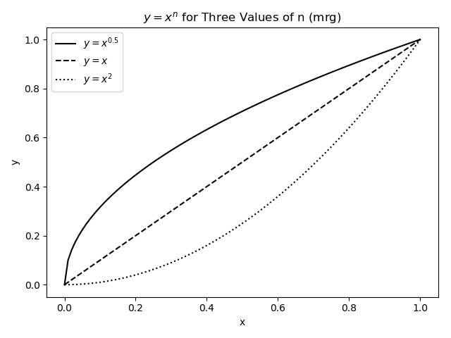
Most of the time, you will be plotting three or fewer different lines on a single window, and they can thus be distinguished from one another in Python by using different line styles.
import numpy as np
import matplotlib.pyplot as plt

x = np.linspace(0, 1, 100)
y1 = x**0.5
y2 = x**1
y3 = x**2

fig, ax = plt.subplots(num=1)
fig.clf()
fig, ax = plt.subplots(num=1)

ax.plot(x, y1, 'k-', label='$y=x^{0.5}$')
ax.plot(x, y2, 'k--', label='$y=x$')
ax.plot(x, y3, 'k:', label='$y=x^2$')
ax.legend(loc='best')
ax.set_title('$y=x^n$ for Three Values of n (mrg)')
ax.set_xlabel('x')
ax.set_ylabel('y')

fig.tight_layout()
fig.savefig('CurvePlotPython.png')
The figure this creates will be:
Note the legend command argument. The default location is upper right but that may land on the data. Telling it to use the best location will have Python look for the most-blank part of the plot. There are many other options for location - try help(plt.legend) and look at the section about loc in the Other Parameters.
Using Different Point Styles
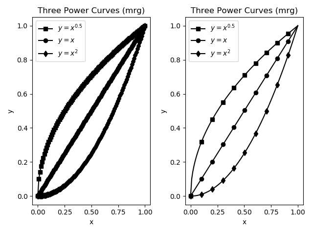
Sometimes there will be more data sets on a graph than there are line styles in Python. In cases like this, you may think to use symbols at the points. The problem with that becomes clear if you have a large number of data points - you do not want to try to jam hundreds of symbols onto a curve. The left graph in the figure below shows what a disaster that could be. Instead, you can plot a line with all your data but then tell Python to plot points only every so often. This is done with the markevery kwarg. The right side of the figure shows the result of this operation. The code for both graphs in the figure is given below it.
import numpy as np
import matplotlib.pyplot as plt

x = np.linspace(0, 1, 100)
y1 = x**0.5
y2 = x**1
y3 = x**2
fig, ax = plt.subplots(num=1)
fig.clf()
fig, ax = plt.subplots(1, 2, num=1)

# left graph (ewwwwwww)
ax[0].plot(x, y1, 'k-s', x, y2, 'k-o', x, y3, 'k-d')
ax[0].legend(['$y=x^{0.5}$', '$y=x$', '$y=x^2$'], loc='best')

ax[0].set_title('Three Power Curves (mrg)')
ax[0].set_xlabel('x')
ax[0].set_ylabel('y')

ax[1].plot(x, y1, 'k-s',
           x, y2, 'k-o',
           x, y3, 'k-d',
           markevery=10)

ax[1].legend(['$y=x^{0.5}$', '$y=x$', '$y=x^2$'],  loc='best')
ax[1].set_title('Three Power Curves (mrg)')
ax[1].set_xlabel('x')
ax[1].set_ylabel('y')

fig.tight_layout()
fig.savefig('DeccurvesPython.png')
Using Different Scales
In the above example, two different scales were used for the data sets - a refined scale for the line and a rougher scale for the data points themselves. In other cases, it is the line that will need the rougher scale. As an example, assume you want Python to numerically find the minimum of the function \(y=3x^2+11x-2\) using the built-in min command. To get the most precise answer possible, you will want to give Python a very large number of points - say, 1 million. That code might look like:
P = [3, 11, -2]
xVals = np.linspace(-3.0, 3.0, int(1e6))
yVals = np.polyval(P, xVals)
yMin = min(yVals)
xMin = xVals[np.where(yVals==yMin)]
print(xMin, yMin)
Since the domain is 6 and there are 1e6 points, the spacing between points is approximately 6e-06. The x-coordinate of the answer then should be very close to the actual answer. In fact, Python determines that the minimum value is -1.208333333332658e+01 and its x-coordinate is -1.833334833334833e+00 - very close to finding the minimum of y=-1.208333333333333e+01 at x=-1.833333333333333e+00
The problem, however, is that if you want to graph this, one million points is somewhat absurd. Unless you are planning to zoom in on the graph, there are around 1000x as many points as necessary/realistic/useful for a plot like this. Instead, you should either recalculate the equation using a smaller set of independent data or plot only some of the data. Code for the former might be:
xPlot = np.linspace(-3, 3, 100)
yPlot = np.polyval(P, xPlot)
plt.plot(xPlot, yPlot, 'k-')
plt.xlabel('x')
plt.ylabel('y')
plt.title('$y=3x^2+11x-2$ (mrg)')
plt.grid(1)
while code for the latter might be:
plt.plot(xVals[::1000], yVals[::1000], 'k-');
plt.xlabel('x');
plt.ylabel('y');
plt.title('$y=3x^2+11x-2$ (mrg)');
plt.grid(1)
The advantage of the first version above is that your domain definitely remains the same - the xPlot variable spans the same [-3, 3] as the xVals set even though it has three orders of magnitude fewer values. The disadvantage is that you will have to re-perform all the calculations on this new set.
The advantage of the second version, then, is that you are using prior data and thus do not have to recalculate anything. The disadvantage is, you might miss out on the tail end of the data. In the above example, slicing from the initial value to the end by taking every 1000 means the last value copied over will be 999001st (in index 990000). This means the maximum value used on the x-axis is xVals[999000] or approximately 2.994 instead of the 3 in the original. If that is a major concern, you should make sure the end of your refined data scale can be "reached" if your incremented indices start with 1 and have some increment. As an example, choosing to have 1000001 points in the original instead of 1000000 means going from 0 by 1e3 to the end will actually end at the 1000000th, and last, index.
Putting Text on a Plot
The text(x, y, MyText)
command will plot the text string MyText at
the (x,y) coordinate. There are several important aspects to the text
command you must remember to use it properly.
First, the text command will not make the figure change its axes
to fit the data automatically. Clear the figure using plt.clf() then try typing:
plt.text(2, 2, 'Hi')
The figure will show the word Hi in the top right but it will not be in the axis limits.
You need to change the axis limits by using the axis command. In this case,
plt.axis((0, 3, 1, 4))
plt.text(2, 3, 'Hi')
will make the x axis go from 0 to 3 and the y axis go from 1 to 4, more than enough space to say "Hi" at (2,3)!
Next, note that
text placed on plots stays until the next plotting command is
issued, so you can use multiple plt.text commands to get several
labels on one plot.
Questions
Post your questions by editing the discussion page of this article. Edit the page, then scroll to the bottom and add a question by putting in the characters *{{Q}}, followed by your question and finally your signature (with four tildes, i.e. ~~~~). Using the {{Q}} will automatically put the page in the category of pages with questions - other editors hoping to help out can then go to that category page to see where the questions are. See the page for Template:Q for details and examples.
External Links
References
- ↑ Applied Numerical Methods with MATLAB for Engineers and Scientists, 2/e, Steven C. Chapra


