Difference between revisions of "MATLAB:Plotting"
| Line 1: | Line 1: | ||
This page will primarily go over some examples of different ways to plot data sets. | This page will primarily go over some examples of different ways to plot data sets. | ||
| + | |||
| + | == Keeping Data Off The Edge == | ||
| + | Typically, you will not want data points to land on the edge of a graph. If you are just plotting lines, this is not a problem but if you are actually putting symbols at each point, those symbols should not cross the border out of the axes. To combat this, you can put a short program called <code>gzoom.m</code> into your directory and run it. The default case is to add 10% to each direction of the graph in the first figure. The first argument specifies what the expansion value should be (if you want it different from 0.1) while the second argument specifies which figure should be expanded (if you want it to be different from the first figure). The gzoom function is: | ||
| + | <source lang="matlab"> | ||
| + | function gzoom(n, f) | ||
| + | % gzoom.m | ||
| + | % Michael R. Gustafson II (mrg@duke.edu) | ||
| + | % Uploaded to pundit.pratt.duke.edu on September 6, 2008 | ||
| + | % | ||
| + | % Function to determine the size of a figure window and increase the size | ||
| + | % GZOOM will increase figure 1 by a factor of | ||
| + | % 0.1 of the original size in each direction | ||
| + | % GZOOM(r) will increase figure 1 by a factor of | ||
| + | % r of the original size in each direction | ||
| + | % GZOOM(r, f) will increase figure 1 by a factor of | ||
| + | % r of the original size in each direction | ||
| + | |||
| + | if nargin==0 | ||
| + | f=gca; n=0.1; | ||
| + | elseif nargin==1 | ||
| + | f=gca; | ||
| + | end | ||
| + | v=axis; | ||
| + | xr = (v(2)-v(1)); | ||
| + | yr = (v(4)-v(3)); | ||
| + | axis(f, [v + n*[-xr xr -yr yr]]); | ||
| + | </source> | ||
== Using Different Line Styles == | == Using Different Line Styles == | ||
Revision as of 00:32, 7 September 2008
This page will primarily go over some examples of different ways to plot data sets.
Contents
Keeping Data Off The Edge
Typically, you will not want data points to land on the edge of a graph. If you are just plotting lines, this is not a problem but if you are actually putting symbols at each point, those symbols should not cross the border out of the axes. To combat this, you can put a short program called gzoom.m into your directory and run it. The default case is to add 10% to each direction of the graph in the first figure. The first argument specifies what the expansion value should be (if you want it different from 0.1) while the second argument specifies which figure should be expanded (if you want it to be different from the first figure). The gzoom function is:
function gzoom(n, f)
% gzoom.m
% Michael R. Gustafson II (mrg@duke.edu)
% Uploaded to pundit.pratt.duke.edu on September 6, 2008
%
% Function to determine the size of a figure window and increase the size
% GZOOM will increase figure 1 by a factor of
%       0.1 of the original size in each direction
% GZOOM(r) will increase figure 1 by a factor of
%       r of the original size in each direction
% GZOOM(r, f) will increase figure 1 by a factor of
%       r of the original size in each direction

if nargin==0
    f=gca; n=0.1;
elseif nargin==1
    f=gca;
end
v=axis;
xr = (v(2)-v(1));
yr = (v(4)-v(3));
axis(f, [v + n*[-xr xr -yr yr]]);
Using Different Line Styles
Most of the time, you will be plotting three or fewer different lines on a single window, and they can thus be distinguished from one another in MATLAB by using different line styles. There are two different ways to get multiple data sets plotted in the same figure - use the hold on...hold off paradigm or pu all the "plot triplets" in a single plot command. What follows is an example of the latter case:
x = linspace(0, 1, 100);
y1 = x.^0.5;
y2 = x.^1;
y3 = x.^2;
plot(x, y1, 'k-', x, y2, 'k--', x, y3, 'k:');
legend('y=x^{0.5}', 'y=x', 'y=x^2', 0);
title('y=x^n for Three Values of n (mrg)');
xlabel('x');
ylabel('y');
print -deps CurvePlot % note that adds .eps to filename
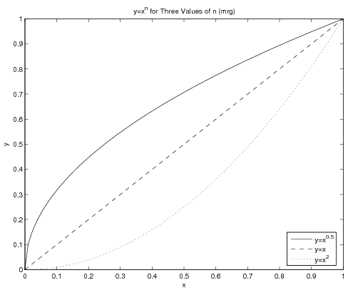
The figure this creates will be:
Note the legend - the use of the final argument 0 will make MATLAB look for the best spot in the window for the legend - which is to say, somewhere not conflicting with any of the lines if at all possible. Also note that the text in the legend and in the title contains basic LaTeX code for obtaining the superscripts.
Using Different Point Styles
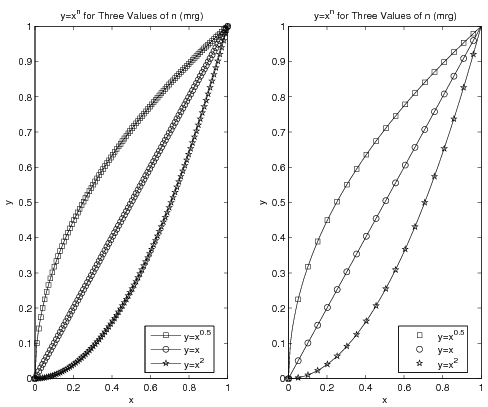
Sometimes there will be more data sets on a graph than there are line styles in MATLAB. In cases like this, you may think to use symbols at the points. The problem with that becomes clear if you have a large number of data points - you do not want to try to jam hundreds of symbols onto a curve. The left graph in the figure below shows what a disaster that could be. Instead, you can plot a line with all your data but plot points on top of the line with only some of the data. The right side of the figure shows the result of this operation. The code for both graphs in the figure is given below it.
x = linspace(0, 1, 100);
y1 = x.^0.5;
y2 = x.^1;
y3 = x.^2;
subplot(1,2,1) % left graph (ewwwwwww)
plot(x, y1, 'k-s', x, y2, 'k-o', x, y3, 'k-p');
legend('y=x^{0.5}', 'y=x', 'y=x^2', 0);
title('y=x^n for Three Values of n (mrg)');
xlabel('x');
ylabel('y');

subplot(1,2,2) % right graph (ooo.  aah.  wow)
plot(x, y1, 'k-', x, y2, 'k-', x, y3, 'k-'); % lines only!
incr = 5;
hold on % hols lines and now add points
PointPlot=plot(...
    x(1:incr:end), y1(1:incr:end), 'ks',...
    x(1:incr:end), y2(1:incr:end), 'ko',...
    x(1:incr:end), y3(1:incr:end), 'kp');
hold off
legend(PointPlot, 'y=x^{0.5}', 'y=x', 'y=x^2', 0);
title('y=x^n for Three Values of n (mrg)');
xlabel('x');
ylabel('y');
Note that the assignment of one of the plots to the variable PointPlot is required so that the legend can be told which set of
plots to use as a basis for the legend. Without this, it would be
possible for the legend to be based on the plot using solid lines (which are
the same for all three data sets) rather than to be based on the
plot using the symbols.
Using Different Scales
In the above example, two different scales were used for the data sets - a refined scale for the line and a rougher scale for the data points themselves. In other cases, it is the line that will need the rougher scale. As an example, assume you want MATLAB to numerically find the minimum of the function \(y=3x^2+11x-2\) using the built-in min command. To get the most precise answer possible, you will want to give MATLAB a very large number of points - say, 1 million. That code might look like:
P = [3 11 -2]
xVals = linspace(-3, 3, 1e6);
yVals = polyval(P, xVals);
yMin = min(yVals)
xMin = xVals(yVals==yMin)
Since the domain is 6 and there are 1e6 points, the spacing between points is approximately 6e-06. The x-coordinate of the answer then should be very close to the actual answer. In fact, MATLAB determines that the minimum value is -1.208333333332658e+01 and its x-coordinate is -1.833334833334833e+00 - very close to finding the minimum of y=-1.208333333333333e+01 at x=-1.833333333333333e+00
The problem, however, is that if you want to graph this, one million points is somewhat absurd. Unless you are planning to zoom in on the graph, there are around 1000x as many points as necessary/realistic/useful for a plot like this. Instead, you should either recalculate the equation using a smaller set of independent data or plot only some of the data. Code for the former might be:
xPlot = linspace(-3, 3, 100);
yPlot = polyval(P, xPlot);
plot(xPlot, yPlot, 'k-');
xlabel('x');
ylabel('y');
title('y=3x^2+11x-2 (mrg)');
grid on
print -deps PolyGraph
while code for the latter might be:
plot(xVals(1:1000:end), yVals(1:1000:end), 'k-');
xlabel('x');
ylabel('y');
title('y=3x^2+11x-2 (mrg)');
grid on
print -deps PolyGraph
The advantage of the first version above is that your domain definitely remains the same - the xPlot variable spans the same [-3, 3] as the xVals set even though it has three orders of magnitude fewer values. The disadvantage is that you will have to re-perform all the calculations on this new set.
The advantage of the second version, then, is that you are using prior data and thus do not have to recalculate anything. The disadvantage is, you might miss out on the tail end of the data. In the above example, going from 1 to 1e6 by 1e3 means the last value copied over will be 999001, meaning the maximum value used on the x-axis is xVals(999001) or approximately 2.994 instead of the 3 in the original. If that is a major concern, you should make sure the end of your refined data scale can be "reached" if your incremented indices start with 1 and have some increment. As an example, choosing to have 1000001 points in the original instead of 1000000 means going from 1 by 1e3 to 10000001 will actually end at the 10000001st, and last, point.

