Difference between revisions of "Python:Plotting Surfaces"
(→Notes) |
|||
| (20 intermediate revisions by the same user not shown) | |||
| Line 13: | Line 13: | ||
* [https://matplotlib.org/tutorials/toolkits/mplot3d.html#toolkit-mplot3d-tutorial The mplot3d Toolkit] | * [https://matplotlib.org/tutorials/toolkits/mplot3d.html#toolkit-mplot3d-tutorial The mplot3d Toolkit] | ||
* [https://matplotlib.org/gallery/index.html#mplot3d-examples-index 3D plotting examples gallery] | * [https://matplotlib.org/gallery/index.html#mplot3d-examples-index 3D plotting examples gallery] | ||
| + | Also, there are several excellent tutorials out there! For example: | ||
| + | * [https://jakevdp.github.io/PythonDataScienceHandbook/04.12-three-dimensional-plotting.html Three-Dimensional Plotting in Matplotlib] from the [http://shop.oreilly.com/product/0636920034919.do Python Data Science Handbook] by [https://www.oreilly.com/pub/au/6198 Jake VanderPlas]. | ||
| + | |||
| + | == Notes == | ||
| + | As of matplotlib 3.2.0, the submodule axes3d no longer needs to be imported from mpl_toolkits.mplot3d. To do a quick check on the command line, try: | ||
| + | import matplotlib | ||
| + | matplotlib.__version__ | ||
| + | If the version is earlier than 3.2.0, you will need to add | ||
| + | from mpl_toolkits.mplot3d import axes3d | ||
| + | to the preamble of the examples below. | ||
== Individual Patches == | == Individual Patches == | ||
| Line 18: | Line 28: | ||
<syntaxhighlight lang=python> | <syntaxhighlight lang=python> | ||
import numpy as np | import numpy as np | ||
| − | |||
import matplotlib.pyplot as plt | import matplotlib.pyplot as plt | ||
| − | fig = plt.figure(num=1 | + | fig = plt.figure(num=1, clear=True) |
| − | + | ax = fig.add_subplot(1, 1, 1, projection='3d') | |
| − | ax = fig.add_subplot( | ||
x = np.array([[1, 3], [2, 4]]) | x = np.array([[1, 3], [2, 4]]) | ||
| Line 32: | Line 40: | ||
ax.set(xlabel='x', ylabel='y', zlabel='z') | ax.set(xlabel='x', ylabel='y', zlabel='z') | ||
| + | fig.tight_layout() | ||
fig.savefig('PatchExOrig_py.png') | fig.savefig('PatchExOrig_py.png') | ||
</syntaxhighlight > | </syntaxhighlight > | ||
| Line 37: | Line 46: | ||
[[File:PatchExOrig_py.png|400 px]] | [[File:PatchExOrig_py.png|400 px]] | ||
</center> | </center> | ||
| + | |||
| + | ====Trinket Version ==== | ||
| + | <html><iframe src="https://trinket.io/embed/python3/027e1bc386?start=result" width="100%" height="300" frameborder="0" marginwidth="0" marginheight="0" allowfullscreen></iframe></html> | ||
Note that the four "corners" above are not all co-planar; Python will thus create the patch using two triangles - to show this more clearly, you can tell Python to change the view by specifying the elevation (angle up from the xy plane) and azimuth (angle around the xy plane): | Note that the four "corners" above are not all co-planar; Python will thus create the patch using two triangles - to show this more clearly, you can tell Python to change the view by specifying the elevation (angle up from the xy plane) and azimuth (angle around the xy plane): | ||
| Line 50: | Line 62: | ||
You can add more patches to the surface by increasing the size of the matrices. For example, adding another column will add two more intersections to the surface: | You can add more patches to the surface by increasing the size of the matrices. For example, adding another column will add two more intersections to the surface: | ||
<syntaxhighlight lang=python> | <syntaxhighlight lang=python> | ||
| − | fig = plt.figure(num=1 | + | fig = plt.figure(num=1, clear=True) |
| − | + | ax = fig.add_subplot(1, 1, 1, projection='3d') | |
| − | ax = fig.add_subplot( | ||
x = np.array([[1, 3, 5], [2, 4, 6]]) | x = np.array([[1, 3, 5], [2, 4, 6]]) | ||
| Line 61: | Line 72: | ||
ax.set(xlabel='x', ylabel='y', zlabel='z') | ax.set(xlabel='x', ylabel='y', zlabel='z') | ||
ax.view_init(elev=30, azim=220) | ax.view_init(elev=30, azim=220) | ||
| + | |||
| + | fig.tight_layout() | ||
</syntaxhighlight> | </syntaxhighlight> | ||
<center> | <center> | ||
| Line 107: | Line 120: | ||
and <code>y</code> specified above - the code would be: | and <code>y</code> specified above - the code would be: | ||
<syntaxhighlight lang=python> | <syntaxhighlight lang=python> | ||
| − | fig = plt.figure(num=1 | + | fig = plt.figure(num=1, clear=True) |
| − | + | ax = fig.add_subplot(1, 1, 1, projection='3d') | |
| − | ax = fig.add_subplot( | ||
(x, y) = np.meshgrid(np.arange(-2, 2.1, 1), np.arange(-1, 1.1, .25)) | (x, y) = np.meshgrid(np.arange(-2, 2.1, 1), np.arange(-1, 1.1, .25)) | ||
| Line 117: | Line 129: | ||
ax.set(xlabel='x', ylabel='y', zlabel='z', title='z = x + y') | ax.set(xlabel='x', ylabel='y', zlabel='z', title='z = x + y') | ||
| + | fig.tight_layout() | ||
</syntaxhighlight> | </syntaxhighlight> | ||
and the graph is: | and the graph is: | ||
| Line 125: | Line 138: | ||
<syntaxhighlight lang=python> | <syntaxhighlight lang=python> | ||
import numpy as np | import numpy as np | ||
| − | |||
import matplotlib.pyplot as plt | import matplotlib.pyplot as plt | ||
from matplotlib import cm | from matplotlib import cm | ||
| − | fig = plt.figure(num=1 | + | fig = plt.figure(num=1, clear=True) |
| − | + | ax = fig.add_subplot(1, 1, 1, projection='3d') | |
| − | ax = fig.add_subplot( | ||
(x, y) = np.meshgrid(np.arange(-2, 2.1, 1), np.arange(-1, 1.1, .25)) | (x, y) = np.meshgrid(np.arange(-2, 2.1, 1), np.arange(-1, 1.1, .25)) | ||
| Line 138: | Line 149: | ||
ax.plot_surface(x, y, z, cmap=cm.copper) | ax.plot_surface(x, y, z, cmap=cm.copper) | ||
ax.set(xlabel='x', ylabel='y', zlabel='z', title='z = x + y') | ax.set(xlabel='x', ylabel='y', zlabel='z', title='z = x + y') | ||
| + | |||
| + | fig.tight_layout() | ||
</syntaxhighlight> | </syntaxhighlight> | ||
| + | <center> | ||
| + | [[Image:SurfExp01c_py.png|400px]] | ||
| + | </center> | ||
| + | |||
To see all the colormaps, after importing the cm group just type | To see all the colormaps, after importing the cm group just type | ||
help(cm) | help(cm) | ||
| Line 151: | Line 168: | ||
the code could be: | the code could be: | ||
<syntaxhighlight lang=python> | <syntaxhighlight lang=python> | ||
| − | fig = plt.figure(num=1 | + | fig = plt.figure(num=1, clear=True) |
| − | + | ax = fig.add_subplot(1, 1, 1, projection='3d') | |
| − | ax = fig.add_subplot( | ||
(x, y) = np.meshgrid(np.arange(-2, 2.1, 1), np.arange(-1, 1.1, .25)) | (x, y) = np.meshgrid(np.arange(-2, 2.1, 1), np.arange(-1, 1.1, .25)) | ||
| Line 161: | Line 177: | ||
ax.set(xlabel='x', ylabel='y', zlabel='z', | ax.set(xlabel='x', ylabel='y', zlabel='z', | ||
title='Distance from (1, -0.5)') | title='Distance from (1, -0.5)') | ||
| + | |||
| + | fig.tight_layout() | ||
</syntaxhighlight> | </syntaxhighlight> | ||
and the plot is | and the plot is | ||
| Line 170: | Line 188: | ||
You can also use a finer grid to make a better-looking plot: | You can also use a finer grid to make a better-looking plot: | ||
<syntaxhighlight lang=python> | <syntaxhighlight lang=python> | ||
| − | fig = plt.figure(num=1 | + | fig = plt.figure(num=1, clear=True) |
| − | + | ax = fig.add_subplot(1, 1, 1, projection='3d') | |
| − | ax = fig.add_subplot( | ||
(x, y) = np.meshgrid(np.linspace(-1.2, 1.2, 20), | (x, y) = np.meshgrid(np.linspace(-1.2, 1.2, 20), | ||
| Line 181: | Line 198: | ||
ax.set(xlabel='x', ylabel='y', zlabel='z', | ax.set(xlabel='x', ylabel='y', zlabel='z', | ||
title='Distance from (1, -0.5)') | title='Distance from (1, -0.5)') | ||
| + | |||
| + | fig.tight_layout() | ||
</syntaxhighlight> | </syntaxhighlight> | ||
and the plot is: | and the plot is: | ||
| Line 330: | Line 349: | ||
could be plotted on a rectilinear grid using: | could be plotted on a rectilinear grid using: | ||
<syntaxhighlight lang=python> | <syntaxhighlight lang=python> | ||
| − | fig = plt.figure(num=1 | + | fig = plt.figure(num=1, clear=True) |
| − | + | ax = fig.add_subplot(1, 1, 1, projection='3d') | |
| − | ax = fig.add_subplot( | ||
(x, y) = np.meshgrid(np.linspace(-1.8, 1.8, 41), | (x, y) = np.meshgrid(np.linspace(-1.8, 1.8, 41), | ||
| Line 341: | Line 359: | ||
ax.set(xlabel='x', ylabel='y', zlabel='z', | ax.set(xlabel='x', ylabel='y', zlabel='z', | ||
title='Rectilinear Grid') | title='Rectilinear Grid') | ||
| + | |||
| + | fig.tight_layout() | ||
</syntaxhighlight> | </syntaxhighlight> | ||
giving | giving | ||
| Line 349: | Line 369: | ||
It could also be plotted on a circular domain using polar coordinates. To do that, ''r'' and <math>\theta</math> coordinates could be generated using meshgrid and the appropriate x, y, and z values could be obtained by noting that <math>x=r\cos(\theta)</math> and <math>y=r\sin(\theta)</math>. z can then be calculated from any combination of x, y, r, and <math>\theta</math>: | It could also be plotted on a circular domain using polar coordinates. To do that, ''r'' and <math>\theta</math> coordinates could be generated using meshgrid and the appropriate x, y, and z values could be obtained by noting that <math>x=r\cos(\theta)</math> and <math>y=r\sin(\theta)</math>. z can then be calculated from any combination of x, y, r, and <math>\theta</math>: | ||
<syntaxhighlight lang=python> | <syntaxhighlight lang=python> | ||
| − | fig = plt.figure(num=1 | + | fig = plt.figure(num=1, clear=True) |
| − | + | ax = fig.add_subplot(1, 1, 1, projection='3d') | |
| − | ax = fig.add_subplot( | ||
(r, theta) = np.meshgrid(np.linspace(0, 1.8, 41), | (r, theta) = np.meshgrid(np.linspace(0, 1.8, 41), | ||
| Line 362: | Line 381: | ||
ax.set(xlabel='x', ylabel='y', zlabel='z', | ax.set(xlabel='x', ylabel='y', zlabel='z', | ||
title='Circular Grid') | title='Circular Grid') | ||
| + | |||
| + | fig.tight_layout() | ||
</syntaxhighlight> | </syntaxhighlight> | ||
produces: | produces: | ||
| Line 371: | Line 392: | ||
You may want to add a color bar to indicate the values assigned to particular colors. This may be done using the <code>colorbar()</code> command but to use it you need to have access to a variable that refers to your surface plot - note how the variable chipplot is used below: | You may want to add a color bar to indicate the values assigned to particular colors. This may be done using the <code>colorbar()</code> command but to use it you need to have access to a variable that refers to your surface plot - note how the variable chipplot is used below: | ||
<syntaxhighlight lang=python> | <syntaxhighlight lang=python> | ||
| − | fig = plt.figure(num=1 | + | fig = plt.figure(num=1, clear=True) |
| − | + | ax = fig.add_subplot(1, 1, 1, projection='3d') | |
| − | ax = fig.add_subplot( | ||
(r, theta) = np.meshgrid(np.linspace(0, 1.8, 41), | (r, theta) = np.meshgrid(np.linspace(0, 1.8, 41), | ||
| Line 385: | Line 405: | ||
title='Circular Grid') | title='Circular Grid') | ||
fig.colorbar(chipplot) | fig.colorbar(chipplot) | ||
| + | |||
| + | fig.tight_layout() | ||
</syntaxhighlight> | </syntaxhighlight> | ||
produces | produces | ||
| Line 392: | Line 414: | ||
== There Is No Try == | == There Is No Try == | ||
| − | <syntaxhighlight lang= | + | <syntaxhighlight lang=python>import numpy as np |
| − | fig = plt.figure(num=1 | + | import matplotlib.pyplot as plt |
| − | + | from matplotlib import cm | |
| − | ax = fig.add_subplot( | + | |
| + | fig = plt.figure(num=1, clear=True) | ||
| + | ax = fig.add_subplot(1, 1, 1, projection='3d') | ||
(theta, phi) = np.meshgrid(np.linspace(0, 2 * np.pi, 41), | (theta, phi) = np.meshgrid(np.linspace(0, 2 * np.pi, 41), | ||
| Line 419: | Line 443: | ||
zticks = [-1, 0, 1], | zticks = [-1, 0, 1], | ||
title='Donut!') | title='Donut!') | ||
| + | |||
| + | fig.tight_layout() | ||
| + | |||
fig.savefig('Donut_py.png') | fig.savefig('Donut_py.png') | ||
</syntaxhighlight> | </syntaxhighlight> | ||
<center> | <center> | ||
| − | [[Image:Donut_py.png| | + | [[Image:Donut_py.png|800px]] |
</center> | </center> | ||
| + | |||
| + | <HTML><iframe src="https://trinket.io/embed/python3/f4b692fdf9?start=result" width="100%" height="560" frameborder="0" marginwidth="0" marginheight="0" allowfullscreen></iframe></html> | ||
== Questions == | == Questions == | ||
Latest revision as of 04:43, 17 October 2022
There are many problems in engineering that require examining a 2-D domain. For example, if you want to determine the distance from a specific point on a flat surface to any other flat surface, you need to think about both the x and y coordinate. There are various other functions that need x and y coordinates.
Contents
Introductory Links
To better understand how plotting works in Python, start with reading the following pages from the Tutorials page:
Also, there are several excellent tutorials out there! For example:
Notes
As of matplotlib 3.2.0, the submodule axes3d no longer needs to be imported from mpl_toolkits.mplot3d. To do a quick check on the command line, try:
import matplotlib
matplotlib.__version__
If the version is earlier than 3.2.0, you will need to add
from mpl_toolkits.mplot3d import axes3d
to the preamble of the examples below.
Individual Patches
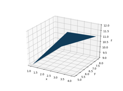
One way to create a surface is to generate lists of the x, y, and z coordinates for each location of a patch. Python can make a surface from the points specified by the matrices and will then connect those points by linking the values next to each other in the matrix. For example, if x, y, and z are 2x2 matrices, the surface will generate group of four lines connecting the four points and then fill in the space among the four lines:
import numpy as np
import matplotlib.pyplot as plt

fig = plt.figure(num=1, clear=True)
ax = fig.add_subplot(1, 1, 1, projection='3d')

x = np.array([[1, 3], [2, 4]])
y = np.array([[5, 6], [7, 8]])
z = np.array([[9, 12], [10, 11]])

ax.plot_surface(x, y, z)
ax.set(xlabel='x', ylabel='y', zlabel='z')

fig.tight_layout()
fig.savefig('PatchExOrig_py.png')
Trinket Version
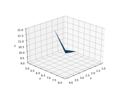
Note that the four "corners" above are not all co-planar; Python will thus create the patch using two triangles - to show this more clearly, you can tell Python to change the view by specifying the elevation (angle up from the xy plane) and azimuth (angle around the xy plane):
ax.view_init(elev=30, azim=45)
plt.draw()
which yields the following image:
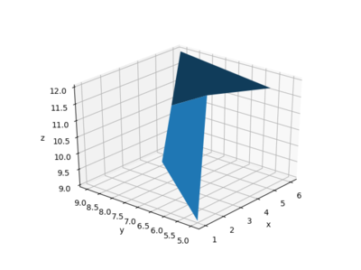
You can add more patches to the surface by increasing the size of the matrices. For example, adding another column will add two more intersections to the surface:
fig = plt.figure(num=1, clear=True)
ax = fig.add_subplot(1, 1, 1, projection='3d')

x = np.array([[1, 3, 5], [2, 4, 6]])
y = np.array([[5, 6, 5], [7, 8, 9]])
z = np.array([[9, 12, 12], [10, 11, 12]])

ax.plot_surface(x, y, z)
ax.set(xlabel='x', ylabel='y', zlabel='z')
ax.view_init(elev=30, azim=220)

fig.tight_layout()
Note the rotation to better see the two different patches.
The meshgrid Command
Much of the time, rather than specifying individual patches, you will have functions of two parameters to plot. Numpy's meshgrid command is specifically used to create matrices that will represent two parameters. For example, note the output to the following Python commands:
In [1]: (x, y) = np.meshgrid(np.arange(-2, 2.1, 1), np.arange(-1, 1.1, .25))
In [2]: x
Out[2]:
array([[-2., -1.,  0.,  1.,  2.],
       [-2., -1.,  0.,  1.,  2.],
       [-2., -1.,  0.,  1.,  2.],
       [-2., -1.,  0.,  1.,  2.],
       [-2., -1.,  0.,  1.,  2.],
       [-2., -1.,  0.,  1.,  2.],
       [-2., -1.,  0.,  1.,  2.],
       [-2., -1.,  0.,  1.,  2.],
       [-2., -1.,  0.,  1.,  2.]])
In [3]: y
Out[3]:
array([[-1.  , -1.  , -1.  , -1.  , -1.  ],
       [-0.75, -0.75, -0.75, -0.75, -0.75],
       [-0.5 , -0.5 , -0.5 , -0.5 , -0.5 ],
       [-0.25, -0.25, -0.25, -0.25, -0.25],
       [ 0.  ,  0.  ,  0.  ,  0.  ,  0.  ],
       [ 0.25,  0.25,  0.25,  0.25,  0.25],
       [ 0.5 ,  0.5 ,  0.5 ,  0.5 ,  0.5 ],
       [ 0.75,  0.75,  0.75,  0.75,  0.75],
       [ 1.  ,  1.  ,  1.  ,  1.  ,  1.  ]])
The first argument gives the values that the first output variable
should include, and the second argument gives the values that the
second output variable should include. Note that the first output
variable x basically gives an x coordinate and the second output
variable y gives a y coordinate. This is useful if you want to
plot a function in 2-D. Note that the stopping values for the arange commands are just past where we wanted to end.
Examples Using 2 Independent Variables
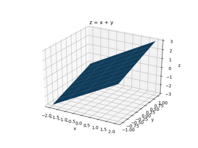
For example, to plot z=x+y over the ranges of x
and y specified above - the code would be:
fig = plt.figure(num=1, clear=True)
ax = fig.add_subplot(1, 1, 1, projection='3d')

(x, y) = np.meshgrid(np.arange(-2, 2.1, 1), np.arange(-1, 1.1, .25))
z = x + y

ax.plot_surface(x, y, z)
ax.set(xlabel='x', ylabel='y', zlabel='z', title='z = x + y')

fig.tight_layout()
and the graph is:
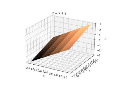
If you want to make it more colorful, you can import colormaps and then use one; here is the complete code:
import numpy as np
import matplotlib.pyplot as plt
from matplotlib import cm

fig = plt.figure(num=1, clear=True)
ax = fig.add_subplot(1, 1, 1, projection='3d')

(x, y) = np.meshgrid(np.arange(-2, 2.1, 1), np.arange(-1, 1.1, .25))
z = x + y

ax.plot_surface(x, y, z, cmap=cm.copper)
ax.set(xlabel='x', ylabel='y', zlabel='z', title='z = x + y')

fig.tight_layout()
To see all the colormaps, after importing the cm group just type
help(cm)
to see the names or go to Colormap Reference to see the colors.
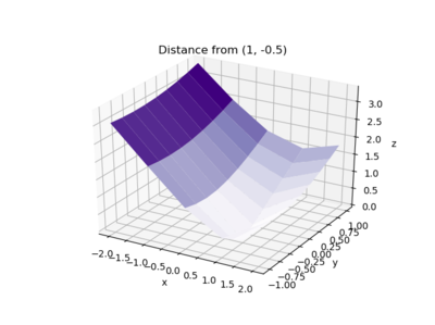
To find the distance r from a particular point, say (1,-0.5), you just need
to change the function. Since the distance between two points \((x, y)\) and \((x_0, y_0)\) is given by
\(
r=\sqrt{(x-x_0)^2+(y-y_0)^2}
\)
the code could be:
fig = plt.figure(num=1, clear=True)
ax = fig.add_subplot(1, 1, 1, projection='3d')

(x, y) = np.meshgrid(np.arange(-2, 2.1, 1), np.arange(-1, 1.1, .25))
z = np.sqrt((x-(1))**2 + (y-(-0.5))**2)

ax.plot_surface(x, y, z, cmap=cm.Purples)
ax.set(xlabel='x', ylabel='y', zlabel='z',
       title='Distance from (1, -0.5)')

fig.tight_layout()
and the plot is
Examples Using Refined Grids
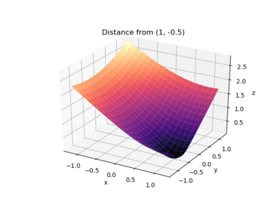
You can also use a finer grid to make a better-looking plot:
fig = plt.figure(num=1, clear=True)
ax = fig.add_subplot(1, 1, 1, projection='3d')

(x, y) = np.meshgrid(np.linspace(-1.2, 1.2, 20),
                     np.linspace(-1.2, 1.2, 20))
z = np.sqrt((x-(1))**2 + (y-(-0.5))**2)

ax.plot_surface(x, y, z, cmap=cm.magma)
ax.set(xlabel='x', ylabel='y', zlabel='z',
       title='Distance from (1, -0.5)')

fig.tight_layout()
and the plot is:
Using Other Coordinate Systems
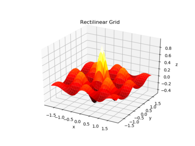
The plotting commands such as plot_surface and plot_wireframe generate surfaces based on matrices of x, y, and z coordinates, respectively, but you can also use other coordinate systems to calculate where the points go. As an example, the function
could be plotted on a rectilinear grid using:
fig = plt.figure(num=1, clear=True)
ax = fig.add_subplot(1, 1, 1, projection='3d')

(x, y) = np.meshgrid(np.linspace(-1.8, 1.8, 41),
                     np.linspace(-1.8, 1.8, 41))
z = np.exp(-np.sqrt(x**2+y**2))*np.cos(4*x)*np.cos(4*y)

ax.plot_surface(x, y, z, cmap=cm.hot)
ax.set(xlabel='x', ylabel='y', zlabel='z',
       title='Rectilinear Grid')

fig.tight_layout()
giving
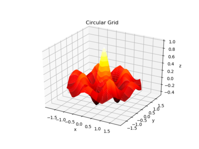
It could also be plotted on a circular domain using polar coordinates. To do that, r and \(\theta\) coordinates could be generated using meshgrid and the appropriate x, y, and z values could be obtained by noting that \(x=r\cos(\theta)\) and \(y=r\sin(\theta)\). z can then be calculated from any combination of x, y, r, and \(\theta\):
fig = plt.figure(num=1, clear=True)
ax = fig.add_subplot(1, 1, 1, projection='3d')

(r, theta) = np.meshgrid(np.linspace(0, 1.8, 41),
                         np.linspace(0, 2*np.pi, 41))
x = r*np.cos(theta)
y = r*np.sin(theta)
z = np.exp(-r)*np.cos(4*x)*np.cos(4*y)

ax.plot_surface(x, y, z, cmap=cm.hot)
ax.set(xlabel='x', ylabel='y', zlabel='z',
       title='Circular Grid')

fig.tight_layout()
produces:
Color Bars
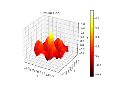
You may want to add a color bar to indicate the values assigned to particular colors. This may be done using the colorbar() command but to use it you need to have access to a variable that refers to your surface plot - note how the variable chipplot is used below:
fig = plt.figure(num=1, clear=True)
ax = fig.add_subplot(1, 1, 1, projection='3d')

(r, theta) = np.meshgrid(np.linspace(0, 1.8, 41),
                         np.linspace(0, 2*np.pi, 41))
x = r*np.cos(theta)
y = r*np.sin(theta)
z = np.exp(-r)*np.cos(4*x)*np.cos(4*y)

chipplot = ax.plot_surface(x, y, z, cmap=cm.hot)
ax.set(xlabel='x', ylabel='y', zlabel='z',
       title='Circular Grid')
fig.colorbar(chipplot)

fig.tight_layout()
produces
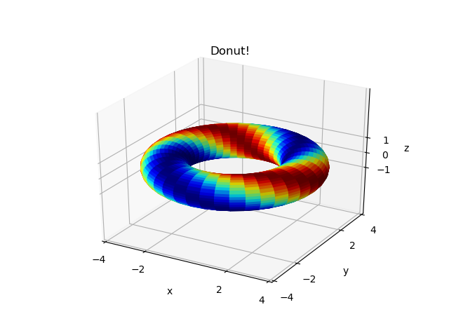
There Is No Try
import numpy as np
import matplotlib.pyplot as plt
from matplotlib import cm

fig = plt.figure(num=1, clear=True)
ax = fig.add_subplot(1, 1, 1, projection='3d')

(theta, phi) = np.meshgrid(np.linspace(0, 2 * np.pi, 41),
                           np.linspace(0, 2 * np.pi, 41))

x = (3 + np.cos(phi)) * np.cos(theta)
y = (3 + np.cos(phi)) * np.sin(theta)
z = np.sin(phi)


def fun(t, f): return (np.cos(f + 2 * t) + 1) / 2


dplot = ax.plot_surface(x, y, z, facecolors=cm.jet(fun(theta, phi)))
ax.set(xlabel='x',
       ylabel='y',
       zlabel='z',
       xlim = [-4, 4],
       ylim = [-4, 4],
       zlim = [-4, 4],
       xticks = [-4, -2, 2, 4],
       yticks = [-4, -2, 2, 4],
       zticks = [-1, 0, 1],
       title='Donut!')

fig.tight_layout()

fig.savefig('Donut_py.png')
Questions
Post your questions by editing the discussion page of this article. Edit the page, then scroll to the bottom and add a question by putting in the characters *{{Q}}, followed by your question and finally your signature (with four tildes, i.e. ~~~~). Using the {{Q}} will automatically put the page in the category of pages with questions - other editors hoping to help out can then go to that category page to see where the questions are. See the page for Template:Q for details and examples.
